Diagram Module User Guide
The Diagram module displays CAN, LIN, DDS signals, and variables as time-based curves. It is used to observe changing signal values during measurement, compare values at different timestamps, adjust the chart range, and review saved Diagram configurations after reopening a project.
Open Diagram
Diagram is available from both Home > Diagram and DataInsights > Diagram. Both entries open the same Diagram window as a dockable ETStudio panel.


Diagram does not start or stop the measurement task by itself. It only controls how the Diagram window receives, freezes, displays, and analyzes data that is already available in the project.
Window Layout
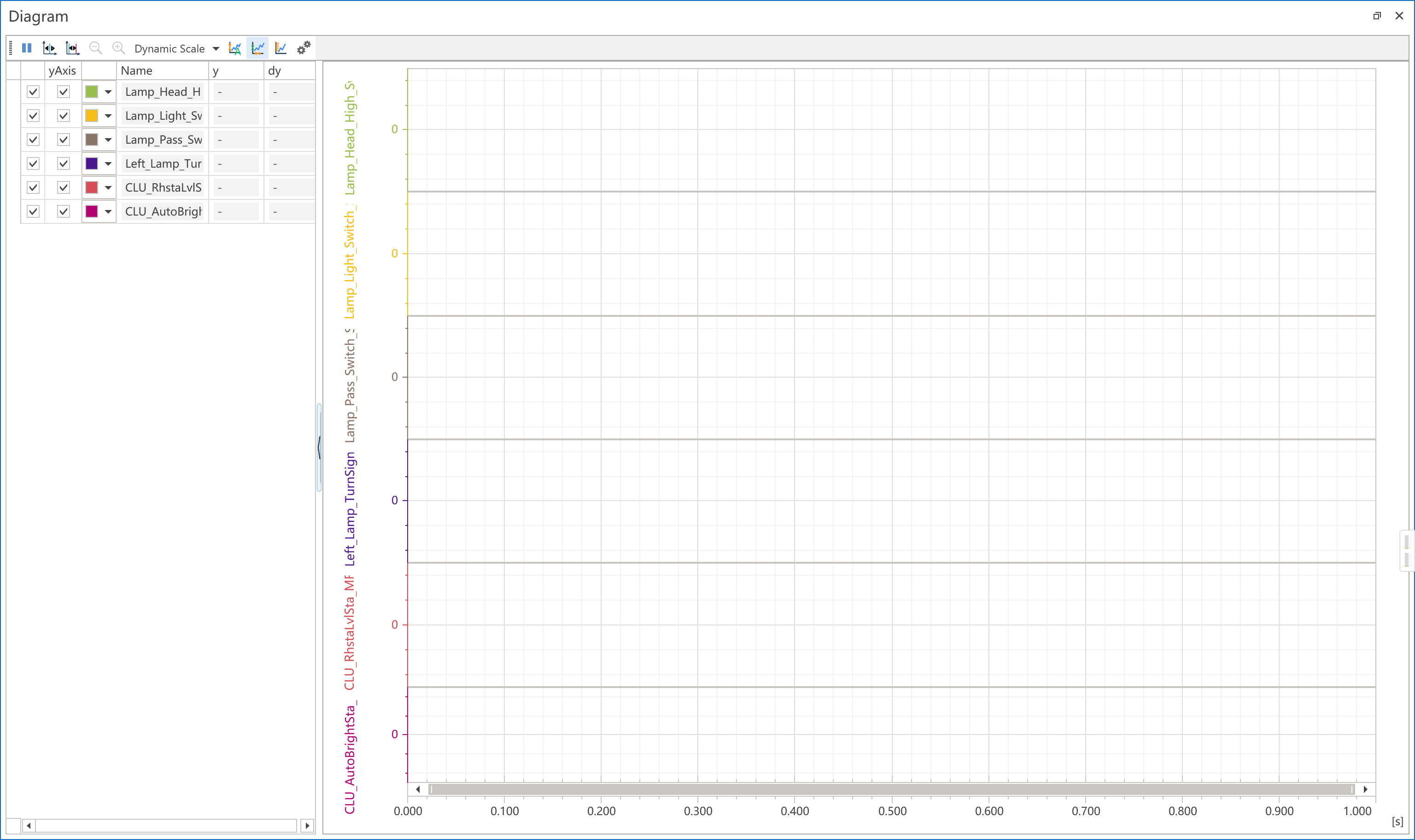
| Area | Description |
|---|---|
| Top toolbar | Provides pause/resume, cursor measurement, zoom, dynamic scale, Auto Fit, Dense Ticks, Visible X Fit, and Diagram Settings. |
| Left signal list | Lists all added signals or variables. Use it to show or hide curves, show or hide Y axes, change colors, view current values, and view delta values. |
| Splitter | Drag the splitter to resize the signal list. Click it quickly to collapse or restore the left list. |
| Chart area | Displays selected curves. The X axis is time in seconds. Each selected signal has its own Y axis. |
| Difference panel | Appears when Cursor or Delta Cursor is enabled and shows cursor timestamps and time difference. |
Add Curves
Right-click the left signal list to open the Diagram context menu.
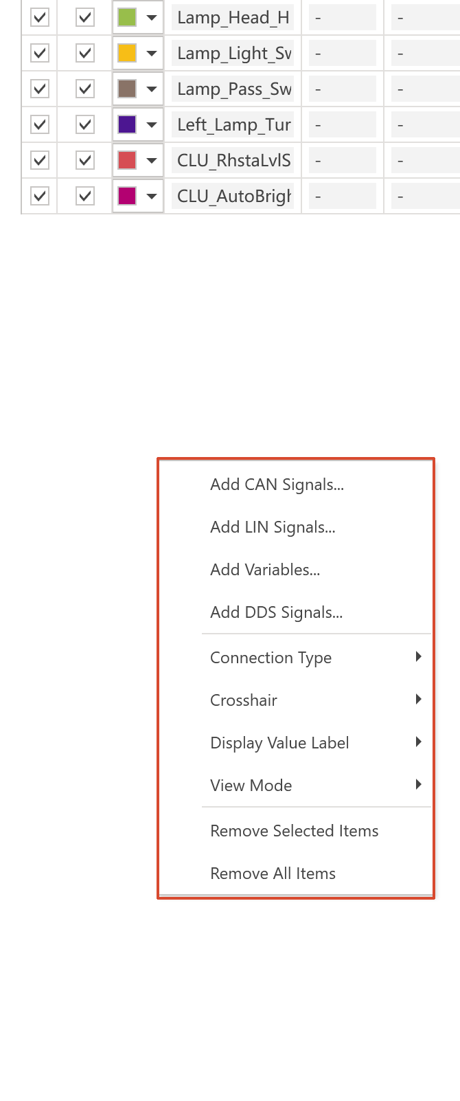
| Menu item | Function |
|---|---|
Add CAN Signals... | Opens the CAN signal selection dialog and adds selected CAN signals or available CAN cycle statistics. |
Add LIN Signals... | Opens the LIN signal selection dialog and adds selected LIN signals. |
Add DDS Signals... | Opens the DDS signal selection dialog and adds selected DDS signals. |
Add Variables... | Opens the variable selection dialog and adds selected variables. |
You can also drag supported signal or trace records from other ETStudio views into the left signal list. If the project does not have a matching channel mapping or network, Diagram shows a message and the signal cannot be added.
Diagram supports up to 99 observed items at the same time. If the limit is reached, remove unused items before adding more signals.
Signal List
| Column | Meaning |
|---|---|
| Checkbox | Shows or hides the curve in the chart. Hidden curves remain in the list and can be shown again later. |
yAxis | Shows or hides the Y axis for that curve. The curve can still be displayed while its axis is hidden. |
| Color | Opens a color picker. The selected color is applied to both the curve and its Y axis. |
Name | Shows the signal or variable name. For bus signals, the channel assignment may be appended to the name. |
y | Shows the latest value. When Cursor is active, it shows the value at the selected cursor timestamp. |
dy | Shows the value difference between the red and blue Delta Cursor positions. |
To remove items, select rows in the list and choose Remove Selected Items, press Delete, or choose Remove All Items from the context menu.
Toolbar Buttons

| Button or menu | Function |
|---|---|
| Pause/Resume | Freezes or resumes Diagram refresh. It does not stop the project measurement. Pausing is useful before measuring values or adjusting ranges. |
Cursor | Shows a blue vertical cursor. The cursor snaps to the nearest data point and updates the y values in the signal list. Click the button again to hide it. |
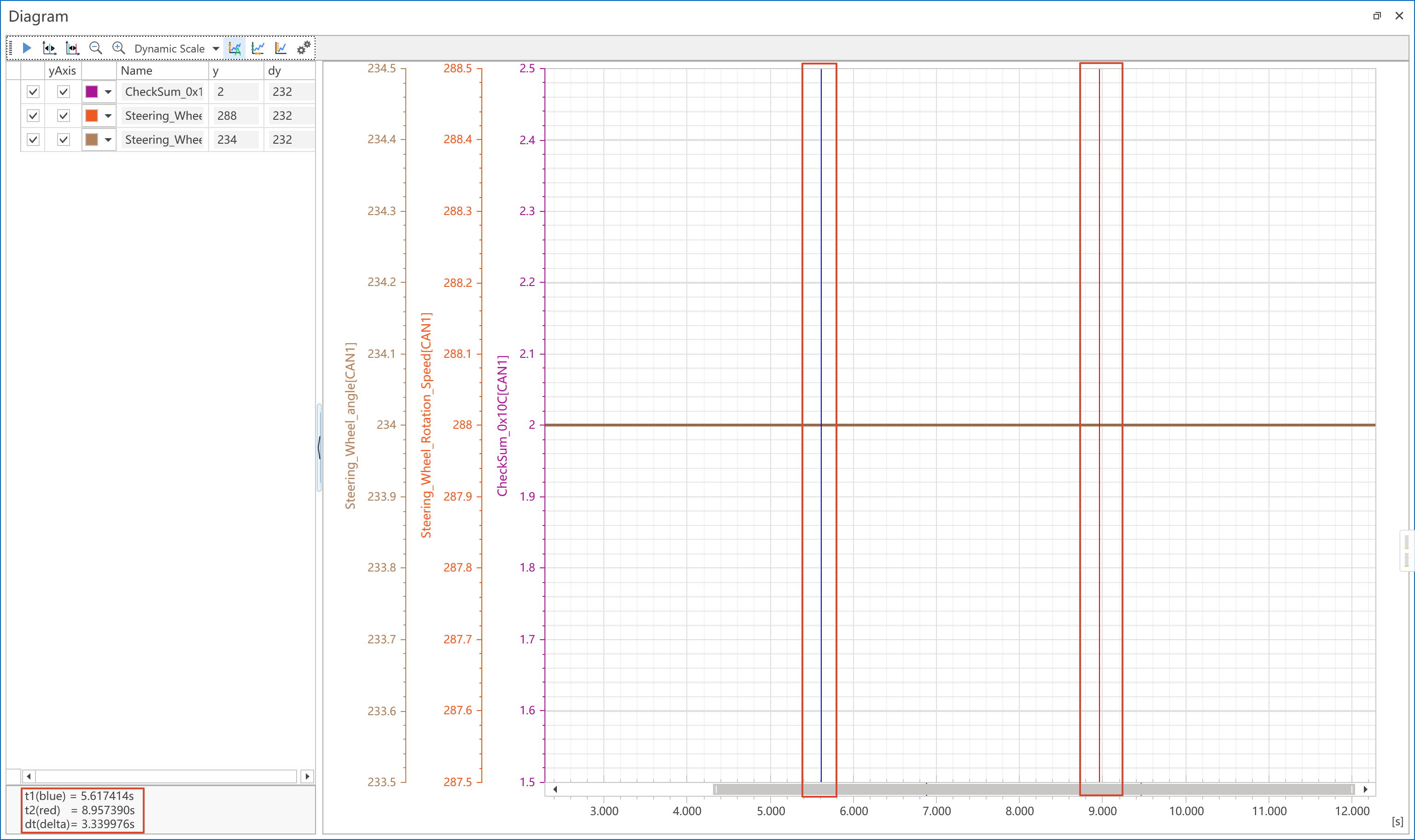
Delta Cursor | Shows blue and red vertical cursors. Diagram shows t1, t2, dt, and each signal's dy. Click the button again to clear the cursors. |
Zoom Out | Expands the visible X-axis time range. This toolbar button is available when Diagram interaction is allowed, typically after pausing. |
Zoom In | Narrows the visible X-axis time range. This toolbar button is available when Diagram interaction is allowed, typically after pausing. |
Dynamic Scale > X Axis | Fits the X axis to the available time range. During live measurement it fits from 0 to the current measurement time. |
Dynamic Scale > Y Axis | Fits Y axes to the current data range. The exact behavior is affected by Visible X Fit. |
Dynamic Scale > XY Axis | Applies both X-axis and Y-axis fitting. |
Auto Fit | Enables or disables automatic Y-axis range fitting for all Y axes. When disabled, Diagram keeps the current visible Y ranges as manual ranges. |
Visible X Fit | When enabled, Y-axis fitting uses only the data inside the currently visible X-axis range. When disabled, it uses the broader available data range. |
Dense Ticks | Shows denser Y-axis tick labels. Disable it if too many Y-axis labels make the chart crowded. |
Settings | Opens the Diagram Settings window. |
Cursor Measurement
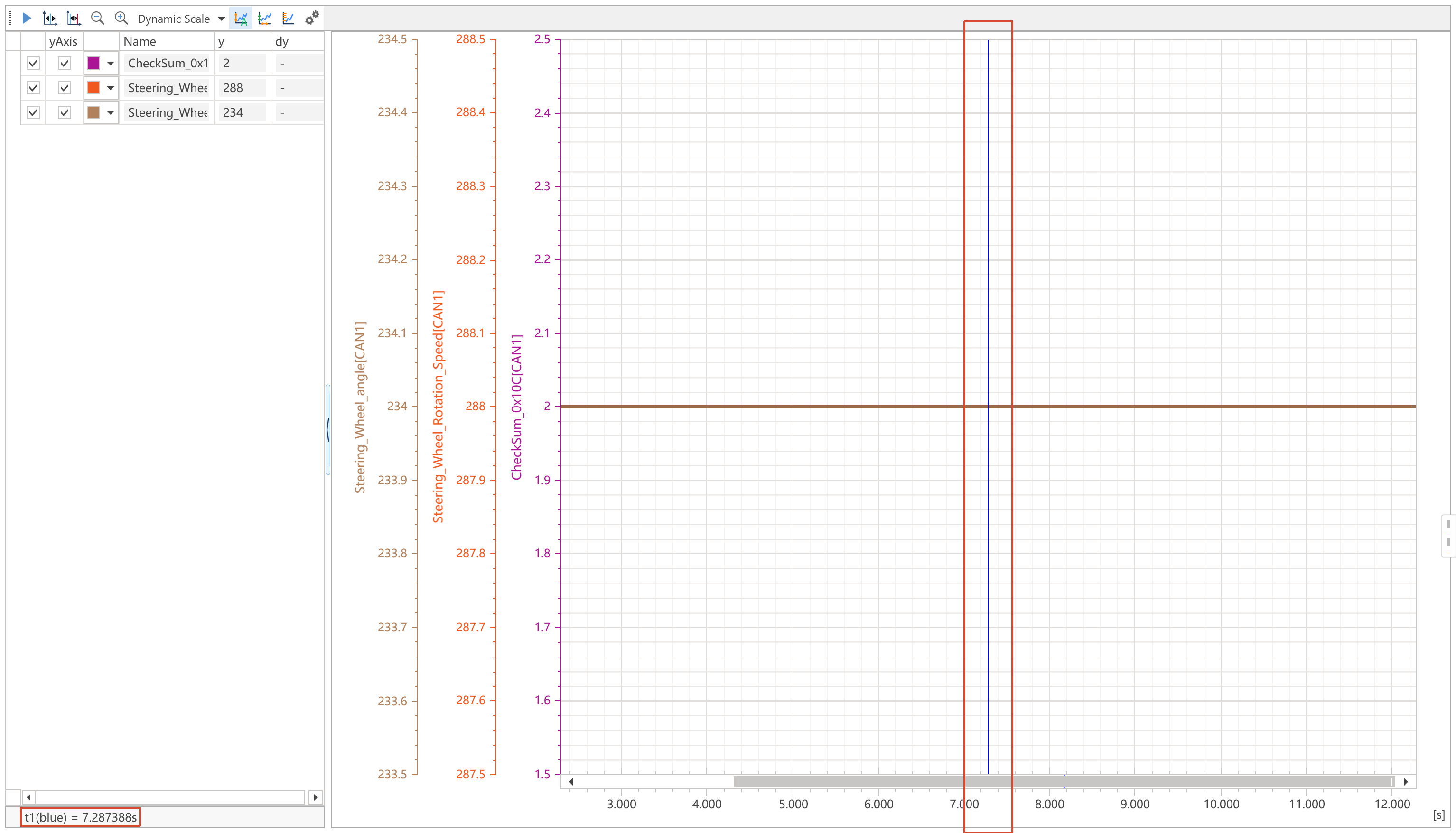
Use Cursor to inspect one timestamp. Diagram shows one blue vertical line, the timestamp in the lower-left difference panel, and the signal value at that timestamp in the y column.
Use Delta Cursor to compare two timestamps. Diagram shows a blue cursor and a red cursor. The difference panel shows t1, t2, and dt, while the dy column shows each signal's value difference between the red and blue cursor positions.
Cursor operation tips:
- Drag a visible cursor line to move it. The cursor snaps to the nearest available data point.
- When Delta Cursor is visible, right-click in the chart area to move the red cursor.
- Cursor and Delta Cursor are available when Diagram interaction is allowed. If the chart is following live data, pause Diagram first.
Adjust the Chart
Zoom
Use the mouse wheel in different areas to zoom different axes:
| Mouse position | Result |
|---|---|
| Plot area | Zooms both the X axis and the relevant Y axis around the mouse position. |
| X-axis area | Zooms the X-axis time range. |
| Y-axis area | Zooms the corresponding Y-axis range. |
You can also drag a rectangle in the plot area to zoom to that region, or use the X-axis scrollbar when it is visible.
During live measurement, the mouse wheel can adjust the visible time window. When Diagram is paused, more interactions are available, including cursor measurement and toolbar X-axis zoom buttons.
Pan
Hold Ctrl and use the mouse wheel to pan:
- Over the plot area or X axis, Diagram pans the visible time range.
- Over a Y axis, Diagram pans that Y axis up or down.
Y-axis range
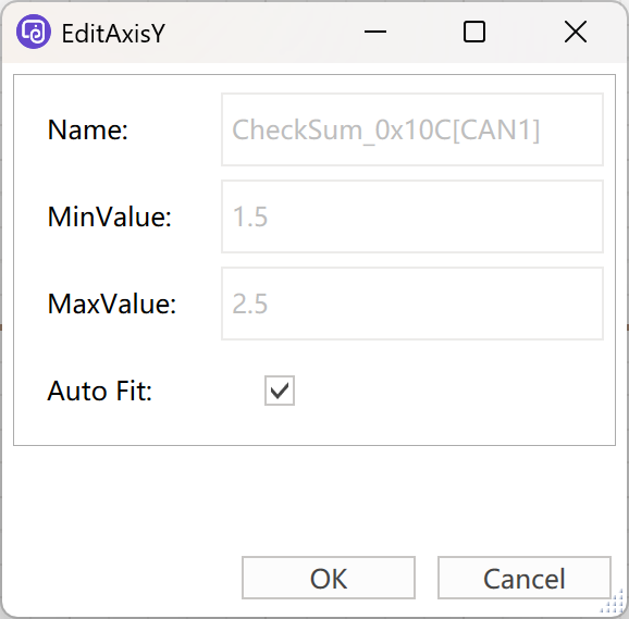
You can adjust a Y axis in three ways:
- Drag a Y axis up or down to move its visible range. This changes that axis to a manual range.
- Double-click a Y axis to open the
EditAxisYwindow. - Double-click the
Name,y, ordycell of a displayed signal to edit that signal's Y axis.
In EditAxisY:
| Field | Meaning |
|---|---|
Name | The signal or variable name. This field is read-only. |
MinValue | The lower bound of the manual Y-axis range. |
MaxValue | The upper bound of the manual Y-axis range. |
Auto Fit | Enables automatic range calculation for this Y axis. When checked, manual Min/Max values are disabled. |
Context Menu Options
The left-list context menu contains appearance and management options.
| Menu group | Options | Meaning |
|---|---|---|
Connection Type | Line, Steps, Dots | Changes how curves are drawn. Line connects points directly, Steps is useful for discrete or state-like signals, and Dots shows sampled points. |
Crosshair | Enable, Disable | Shows or hides hover crosshair labels in the chart. |
Display Value Label | Display, Hide | Shows or hides value-table labels on Y axes. This is useful for signals whose numeric values map to textual states. |
View Mode | Assemble View, Separated View | Assemble View displays selected curves in one plot area. Separated View gives each selected curve its own pane with the same time axis. |
| Item management | Remove Selected Items, Remove All Items | Removes selected curves or clears the list. |
Diagram Settings
Open Settings from the toolbar.
Appearance
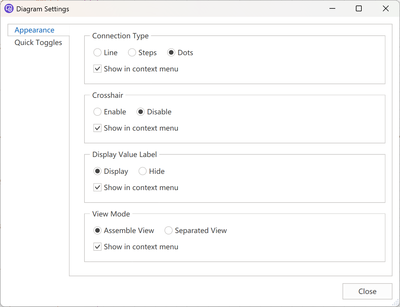
| Setting | Meaning |
|---|---|
Connection Type | Sets the curve drawing style for current curves and future curves. |
Crosshair | Enables or disables hover crosshair labels. |
Display Value Label | Shows or hides value-table labels on Y axes. |
View Mode | Switches between one combined plot area and separate panes. |
Show in context menu | Controls whether the corresponding group is shown in the left-list context menu. |
Quick Toggles
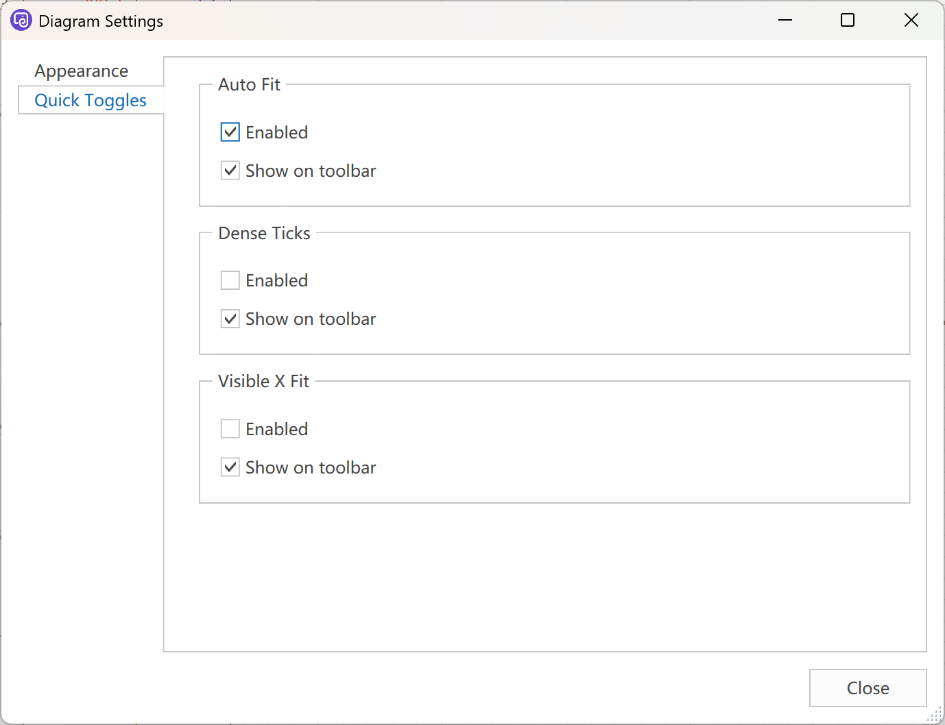
| Setting | Meaning |
|---|---|
Auto Fit > Enabled | Enables automatic Y-axis range fitting for all Y axes. |
Auto Fit > Show on toolbar | Shows or hides the Auto Fit button on the toolbar. |
Dense Ticks > Enabled | Enables denser Y-axis tick labels. |
Dense Ticks > Show on toolbar | Shows or hides the Dense Ticks button on the toolbar. |
Visible X Fit > Enabled | Makes Y-axis fitting use only data inside the visible X-axis range. |
Visible X Fit > Show on toolbar | Shows or hides the Visible X Fit button on the toolbar. |
Settings apply immediately. Close the window when you finish changing options.
Save and Reload Behavior
When the project is saved, Diagram saves the signal list, selected state, curve colors, Y-axis visibility, drawing style, crosshair setting, value-label setting, view mode, Auto Fit, Dense Ticks, Visible X Fit, toolbar visibility, context-menu visibility, and Y-axis range settings.
When the project is reopened, Diagram restores the saved configuration. If a saved signal or variable no longer exists in the current project, re-add it from the selection dialog after restoring the required database, channel mapping, or variable definition.
During measurement restart, Diagram clears old runtime data, keeps the previous visible time window and Y-axis range settings, and then continues drawing new incoming data.
Common Checks
| Symptom | Check |
|---|---|
| A signal cannot be added | Check whether the project has a valid channel mapping and matching network/database configuration. |
| Curves are not visible | Check the row checkbox, the measurement state, and whether the source signal still exists. |
| Y-axis labels are too crowded | Hide unused Y axes, switch to Separated View, or disable Dense Ticks. |
| The Y-axis range is not suitable | Use Dynamic Scale > Y Axis, enable Auto Fit, or double-click the Y axis to set Min/Max manually. |
| Cursor buttons are disabled | Pause Diagram or stop measurement, then try the cursor operation again. |