Panel
Panels enable users to design custom application interfaces for modifying symbol values and displaying them using pre-defined controls, such as input-output boxes or pointer instruments.
Panel Menu
The Panel Menu is divided into two distinct sections: Saved Panels Section and Main Menu.

Saved Panels Section
The Saved Panels section displays all saved or imported panels in your current OAK project, ready for immediate execution. To explore a panel’s live functionality, simply click on it to open its running view.
Main Menu
(1) Create Panel
Access the Panel Designer to tailor your panel interface to your specific needs. Using the designer, you can:
- Create a new panel from scratch.
- Edit an existing panel file to refine or update its design.
(2) Add Panel
Import a panel from external files and instantly launch its running view for execution.
(3) Panel Configuration
Configure and manage saved panels in your OAK project.
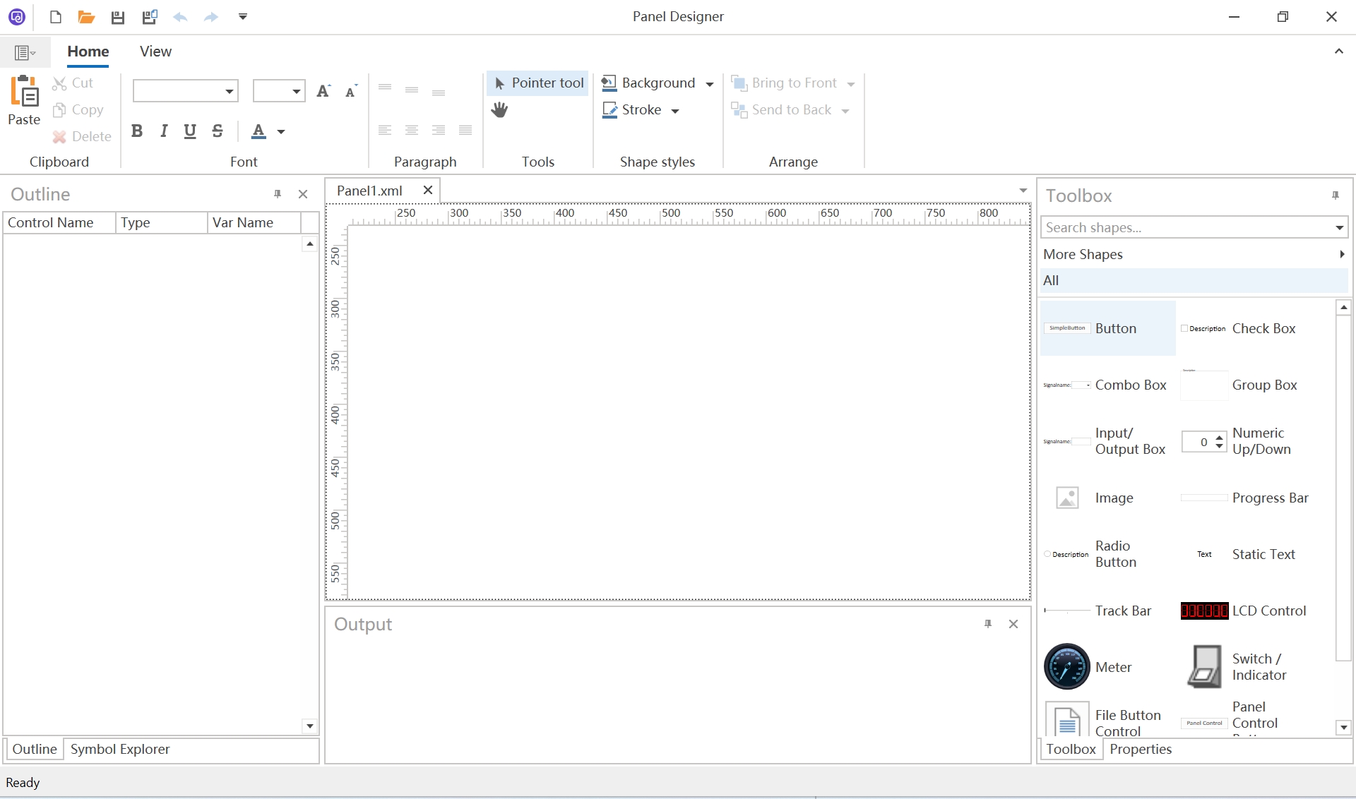
Panel Toolbar
You can perform a variety of operations to modify both the functionality and appearance of controls. These include:
- Copy, Cut, Paste controls for quick duplication or repositioning.
- Arrange controls to organize your layout effectively.
- Adjust the canvas size to accommodate your design needs.
- Edit the font, alignment, and other text properties for enhanced readability.
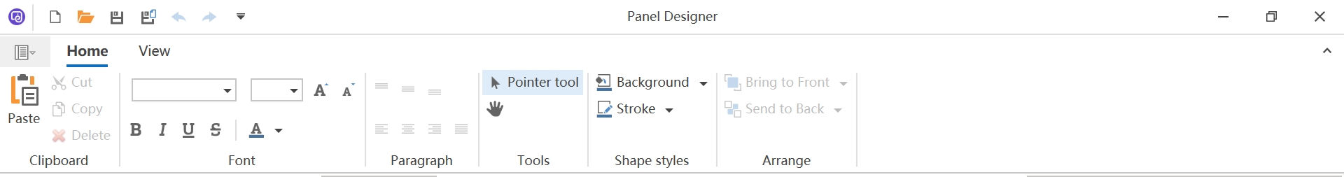
Panel Views
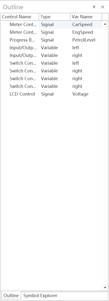
The Outline View offers a comprehensive overview of all controls and their associated symbols on the current canvas.
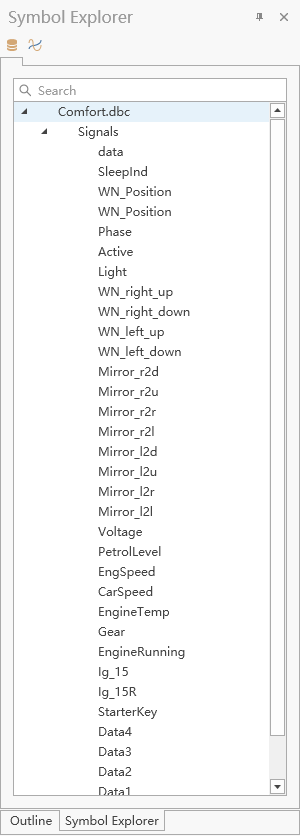
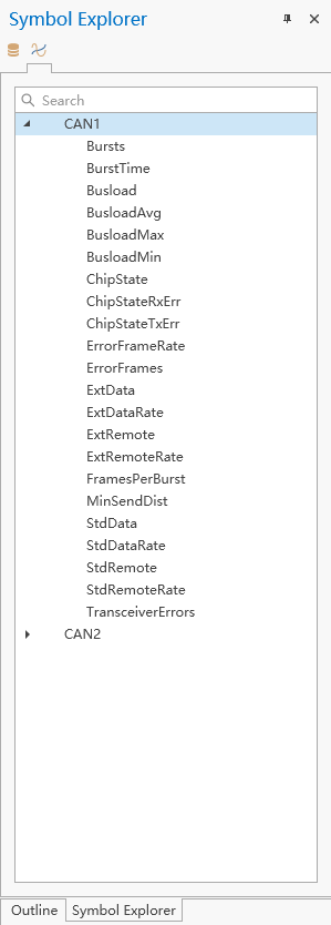
The Symbol Explorer View displays a comprehensive list of available Signals and System Variables that can be seamlessly bound to controls.
Symbol Explorer - Signal
Symbol Explorer - System Variables
Panel Controls
Panel Common Properties
| Property Name | Description |
|---|---|
| Symbol Filter | The symbol type to associate with the control. |
| Value | The associated symbol value of the control. |
| X | The x-axis coordinate of the control. |
| Y | The y-axis coordinate of the control. |
| Width | The width of the control. |
| Height | The height of the control. |
| Background | The background color of the control. |
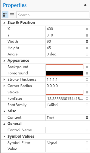
Text
The Text Control is designed to display static text or real-time values from signals (such as CAN, LIN, or system variables). By customizing its properties, you can achieve advanced and tailored display effects, as illustrated below:

In addition to the common properties mentioned earlier, a text control offers four additional customizable properties.
| Property Name | Description |
|---|---|
| Content | The text you want to display. |
| FontSize | The Font Size of the text. |
| FontFamily | The Font Family of the text. |
| Foreground | The Font Color of the text. |
Image
The Image Control is designed to display static pictures for end users. It supports a wide range of common image formats, including PNG, JPG, BMP, SVG.

To use it:
- Select the Image Control.
- Open the Properties Panel.
- Click on the ImagePath property.
- Choose the desired image from the pop-up image selection dialog.
| Property Name | Description |
|---|---|
| Image | The image you want to display. |
| Flip | Specifies how to flip the image. |
| Stretch | Defines how to stretch the image. |

Button
A Button is a push-button control that sets its associated signal to the press value when in the "Pushed" state and to the release value when in the "Unpushed" state.
| Property Name | Description |
|---|---|
| Pressed | The value of symbol when the button is pressed. |
| Released | The value of symbol when the button is released. |

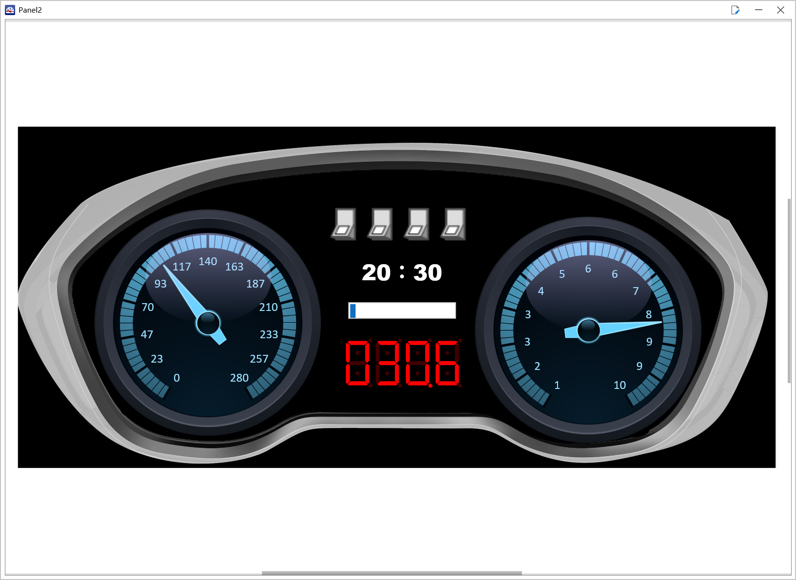
Progress Bar
A progress bar serves as an animated visual indicator for general progress monitoring. It is a display-only control designed to monitor signal values or system variable values.

A progress bar has 2 additional properties:
Min and Max defines the range of signal values to be displayed. For example, in the image above, the Min value is set to 0 and the Max value is 100. If the signal's actual value exceeds the Max value, the progress bar will remain at 100% of the displayed range.
| Property Name | Description |
|---|---|
| Minimum | The minimum value of the progress bar. |
| Maximum | The maximum value of the progress bar. |

Switch/Indicator
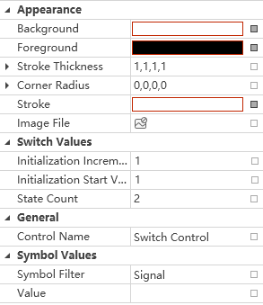
A switch is a control that enables users to simulate actions such as turning lights on/off or shifting gears. To configure the switch, the user can provide an image containing **"State Count + 1"** horizontally separated pictures. For example, a light switch with two states (on and off) would require an image with three horizontally separated state pictures: one for the editing state, one for the off state, and one for the on state. This design allows for intuitive visual representation and interaction with the switch.
The user can utilize this control to send different switch values to associated signals or system variables. It is ideal for turning systems on or off, switching between operational modes, or managing various states within a system. This functionality provides a dynamic and interactive way to simulate your panel.

| Property Name | Description |
|---|---|
| Image | The image used to represent the switch. |
| Initialization Increment | The value added when the switch transitions to the next state. |
| Initialization Start Value | he initial value of the switch in its starting state. |
| State Count | The total number of states the switch can have. |
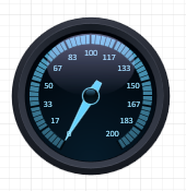
Meter
Meter can be used for real-time monitoring of signals or system variables. It's a display only control.
A meter has 2 additional properties as shown below:
| Property Name | Description |
|---|---|
| Minimum | The minimum value of the meter. |
| Maximum | The maximum value of meter. |

Input/Output Box
An Input-Output Box is a text control designed to display or modify signal values.
| Property Name | Description |
|---|---|
| Text | The text you want to display |

Combo Box
A Combo Box is a “Text – Value” list, which represents a combo box, which is a button with a list box attached to it. Click the button to display the list. You can select an item from the list and it will appear as the button's text. You can type text directly into the combo box button. For example, if you select “2” in the list below, you will see the signal value associated to this selector changed to 2:

| Property Name | Description |
|---|---|
| Text | The text you want to display |

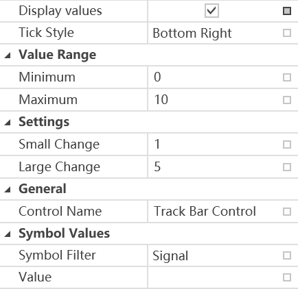
Track Bar
The track bar is a versatile control element for adjusting values in applications that require tracking functionality.

A track bar displays its associated signal value in real-time within its supported range. If the signal exceeds the track bar’s maximum range, the track bar will display the value at its upper limit.
Additionally, a track bar includes two configurable properties, as shown below:
| Property Name | Description |
|---|---|
| Minimum | The minimum value of the track bar. |
| Maximum | The maximum value of the track bar. |
| Small Change | Increment for the symbol value, what is used when the arrow buttons are pressed and the adjuster is operated. |
| Large Change | Increment for the symbol value, what is used when the <Page Down> / <Page Up> buttons are pressed and by clicking next to the adjusters. |
| Tick Style | Specifies whether or where to display the ticks in the track bar. |
Numeric Up/Down
The numeric up/down control enables precise numerical adjustments. By clicking the up/down buttons, they can increment/decrement the value, which automatically updates the associated symbol value.
| Property Name | Description |
|---|---|
| Minimum | The minimum value of the numeric up/down control. |
| Maximum | The maximum value of the numeric up/down control. |
| Increment | Indicates the amount to increment or decrement on each button click. |
| Decimal Places | Indicates the number of decimal places after the decimal point. |

Check Box
A checkbox is a binary selector that toggles between ON (selected) and OFF (cleared) states.

A checkbox also displays the state of its associated signal. For example,we set the check box’s "Activated" is 3, and "Deactivated" is 2.
Then the following
- Associated signal = 3 -> Checkbox is automatically checked.
- Associated signal = 2 -> Checkbox is automatically unchecked.
- Associated signal = 1 (or any other value != 3 or 2) -> Checkbox remains unchecked.
A check box has 2 additional properties:
| Property Name | Description |
|---|---|
| Text | The text you want to display |
| Activated | Indicates the switch value set when the option is activated. |
| Deactivated | Indicates the switch value set when the option is deactivated. |

Radio Button
RadioButton, also called option button, presents a set of mutually exclusive choices. You can create individual radio buttons or use a group to automatically arrange radio buttons into groups. You can group radio buttons to let the user select one from a limited set of choices.

Radio button also displays the signal real-time value if the value matches its “ON state value”.
| Property Name | Description |
|---|---|
| Text | The text you want to display |
| Activated | Indicates the switch value set when the option is activated. |
LCD Control
The LCD Control simulates an LCD screen for real-time monitoring of signals and system variables. This is a read-only display element.

| Property Name | Description |
|---|---|
| After Decimal Point | Indicates the number of decimal places after the decimal point. |
| Before Decimal Point | Indicates the number of decimal places before the decimal point. |

Group Box
Represents a graphical control used to arrange multiple related graphical controls on the surface of a form.

Use GroupBox whenever you need to arrange multiple related controls on a form (for instance, multiple radio buttons or check boxes). The most commonly grouped controls are radio buttons. After placing a group box on a FireMonkey form, select components from the Toolbox and place them in the group box. The Text property contains text that labels the group box at run time.
| Property Name | Description |
|---|---|
| Text | The text you want to display |
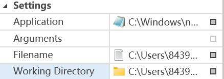
File Button Control
The File Button Control launches the associated file using its default application or specified application.
| Property Name | Description |
|---|---|
| Application | Indicates which application is to be started to open the file. |
| Argument | Specifies the arguments for the application. |
| Filename | Indicates which file is to be opened when the button is clicked. |
| Working Directory | Indicates which working directory should be used for the application. |
Path Dialog
The Path Dialog Control opens a file browser dialog and assigns the selected file/folder path to its linked variable.

| Property Name | Description |
|---|---|
| Dialog File Filter | Indicates the filters for the File dialog. |
| Dialog Title | Configures the dialog title for the Open File diaglog. With the 'default' setting the standard diaglog title is used. |
| Diaglog Type | Indicates whether clicking the button calls up the Open File, Open Folder or Save File dialog. |

Panel Control Button
Panel control button
A Panel control button can be used to open another panel when you clicked the button.
| Property Name | Description |
|---|---|
| Refereneced Panels | Specifies a list of panels, which should be opened if button is pressed. |

Start Stop Control
Start stop button controls whether the measurement should be started or stoped. There are no additional properties assigned with start stop button.
